Matplotlib cookbook
Let me show you how to plot histograms suitable for high energy physics using the Python package
matplotlib. I use it to draw figures for publications and such. It's really very nifty, and you can make just about anything. I recently read (full disclosure: the publisher sent it to me, asking for a review) a cookbook for making plots with matplotlib,
this guy here by
Alexandre Devert. First question you might want to ask is the following: Given that matplotlib is free software, with a quite extensive base of very introductory tutorials, which I can get for free online, why would I pay money for a pdf consisting basically of tutorials? Well, I guess if you don't know anything about Pyhton or matplotlib to begin with -- say you are an interested high school student or just started university and want to make an extra effort -- then I guess this book could be suited for you.
The book basically goes through a number of recipe for plotting various figures, very similar to the ones found in the matplotlib doc. I'm not gonna go on about it here, I would rather show you how I use matplotlib to plot nice histograms for high energy physics.
So, matplotlib is easy. Almost too easy. If you want to plot a histogram, documentation (and the cookbook) tells you to do something like this (in Python):
import numpy

import matplotlib.pyplot as plt


values = numpy.random.randn(1000)

plt.hist(values)

plt.savefig("hist.jpg")
to get something like this figure:
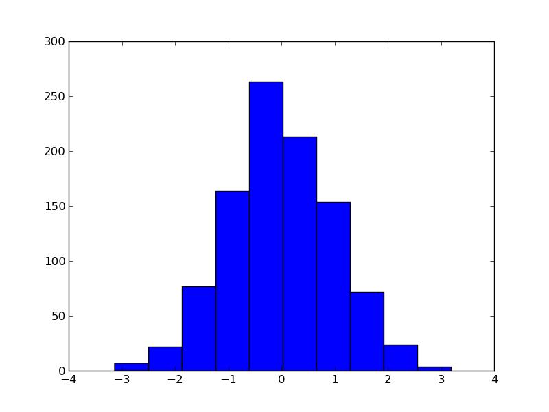
Very easy. Almost too easy. Problem is: this is not how I, nor anyone I know, works. I use histograms a lot. Basically any experiment you can do in high energy physics involves counting, and histograms are the way to visualize this. I cannot work with big, rectangular bins, I need errorbars, and I need to be able to put several histograms in one plot and actually be able to view the contents. I would also need access to bin contents along the way, to produce eg. the ratio of multiple histograms. I am fully aware that the philosophy of matplotlib is to make the easy very easy, but I might argue that the example above is a bit too easy to be useful. Luckily I can do what I want, and I will walk you through the process.
import numpy

import matplotlib.pyplot as plt


# Give me the same values as before

values = numpy.random.randn(1000)


# I use the numpy histogram as it is easier to get its contents

# In real life application I use a dedicated histogramming package

# Second argument is my choice of binning

_bins, _edges = numpy.histogram(values,numpy.arange(-5,5,0.1))


plt.plot(_edges[:len(_edges)-1],_bins)


plt.savefig("hist2.jpg")
which would give the figure below:
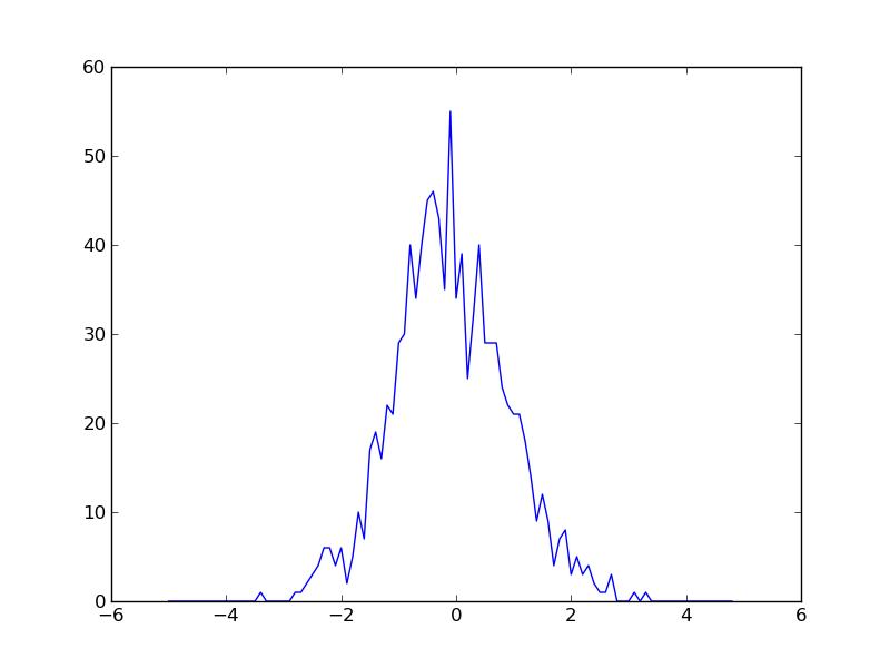
This is not way more complicated, but very neccesary to provide the tools for what we're going to do now. We could provide errorbars. Only problem is that the builtin function errorbar() has the same problems as hist(). So I draw my own, simply by drawing a vertical line. I also want to emphasize that this is binned data without drawing very wide bins. I do that by marking bin centers with a small o. All in all it's just a matter of adding a function to calculate the error, and then drawing it:
import numpy

import matplotlib.pyplot as plt


def error(bins,edges):

	# Just estimate the error as the sqrt of the count

	err =  [numpy.sqrt(x) for x in bins]

	errmin = []

	errmax = []

	for x,err in zip(bins,err):

		errmin.append(x-err/2)

		errmax.append(x+err/2)

	return errmin, errmax


# Give me the same values as before

values = numpy.random.randn(1000)


# I use the numpy histogram as it is easier to get its contents

# In real life application I use a dedicated histogramming package

# Second argument is my choice of binning

_bins, _edges = numpy.histogram(values,numpy.arange(-5,5,0.5))


bins = _bins

edges = _edges[:len(_edges)-1]

errmin, errmax = error(bins,edges)

# Plot as colored o's, connected

plt.plot(edges,bins,'o-')

# Plot the error bars

plt.vlines(edges,errmin,errmax)


plt.savefig("hist3.jpg")
which would give something like this:

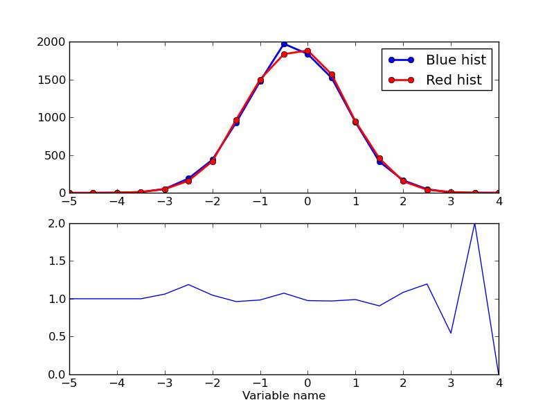
I know we are somewhat beyond introductory now, but let me proceed, as this is stuff I would have loved someone to tell me at some point. Now let me add another histogram, and plot both, along with a ratio of the two. This is also something I use all the time, as a ratio plot is excellent for showing the difference between eg. data and simulation. I have also added a legend and an axis label such that it is visible how to do something like that. Happy plotting.
import numpy

import matplotlib.pyplot as plt


def error(bins,edges):

	# Just estimate the error as the sqrt of the count

	err =  [numpy.sqrt(x) for x in bins]

	errmin = []

	errmax = []

	for x,err in zip(bins,err):

		errmin.append(x-err/2)

		errmax.append(x+err/2)

	return errmin, errmax


def getRatio(bin1,bin2):

	# Sanity check

	if len(bin1) != len(bin2):

		print "Cannot make ratio!"

	bins = []

	for b1,b2 in zip(bin1,bin2):

		if b1==0 and b2==0:

			bins.append(1.)

		elif b2==0:

			bins.append(0.)

		else:

			bins.append(float(b1)/float(b2))

	# The ratio can of course be expanded with eg. error

	return bins


# Give me the same values as before

values = numpy.random.randn(10000)


# Also values for another histogram

values2 = numpy.random.randn(10000)


# I use the numpy histogram as it is easier to get its contents

# In real life application I use a dedicated histogramming package

# Second argument is my choice of binning

_bins, _edges = numpy.histogram(values,numpy.arange(-5,5,0.5))

_bins2, _edges2 = numpy.histogram(values2,numpy.arange(-5,5,0.5))


bins = _bins

edges = _edges[:len(_edges)-1]

bins2 = _bins2

edges2 = _edges2[:len(_edges2)-1]


errmin, errmax = error(bins,edges)

errmin2, errmax2 = error(bins2,edges2)


fig = plt.figure()

ax = fig.add_subplot(2,1,1)


# Plot as colored o's, connected

ax.plot(edges,bins,'o-',color="blue",lw=2,label="Blue hist")

ax.plot(edges2,bins2,'o-',color="red",lw=2,label="Red hist")

leg = ax.legend()

# Plot the error bars

ax.vlines(edges,errmin,errmax)

ax.vlines(edges2,errmin2,errmax2)


# Plot the ratio

ax = fig.add_subplot(2,1,2)

rat = getRatio(bins,bins2)

ax.plot(edges,rat)

ax.set_ylim(0,2)

ax.set_xlabel("Variable name")


plt.savefig("hist4.jpg")
Machine Learning Contest
I have come across a contest that looks really exciting. The people over at
Kaggle are hosting a programming contest about particle physics. Kaggle is a rather interesting platform, which hosts contests involving "big data". You know, the much celebrated buzzword. The idea behind the contests is, that all participants is given a large histotic dataset or a simulation, and based on that, using any technique they want, they are supposed to predict future behaviour. Say for example that an insurance company would like to know what kinds of extra insurance they could sell to existing customers. They would supply the Kaggle contest with historic sales data, and based on that, contestants could for example find that they should focus on selling life insurance to a certain subgroup of people, to maximize the value from their effort. The means to do such an analysis, is often various machine learning techniques. Luckily these can also be used to solve problems that are actually interesting...
The problem that needs to be solved is rooted in the fact that even though the aim of the large particle physics experiments, like
ATLAS , is to produce exotic particles such as the much celebrated Higgs boson, such particles are never seen directly in the detector, as they decay even before they leave the innermost part of the detector; the pipe in which the proton beams collide. All the physicists at the experiments can do is to try and calculate "back" from the stuff the Higgs bosons decay to. The efficiency of such calculations is of course an important matter, as it will determine how well the Higgs bosons can be observed.
The contest at kaggle wants participants to employ machine learning techniques to do this calculation for a certain type of Higgs decays. As this is something I have done before in
one of my courses, albeit for another decay channel, this is of course something I want to to, probably over the summer. My idea is to take this opportunity to learn another of the free, open source frameworks for image analysis techniques, perhaps
OpenCV.
My idea is to use traditional techniqes like boosted decision trees, but with the caveat that I dont want to just train them against a signal background sample, but instead train against the different types of background vs. the signal. I suspect that this would allow me to achieve better separation, as different processes would populate phase space differently.
If you think this sounds interesting and would like to know more, you should head over to Kaggle. If you already know something, especially about more exotic machine learning techniques, and want to form a team, feel free to
contact me!
Open election data
After the 2014 election for the European parliament, I did a fun, small project with open election data. Turns out that the Danish national office for statistics makes data about all polling stations freely available to the public though their
website (largely in Danish). The data are basically all personal and party votes from all polling stations. Since it is possible to view historical data as well, it is possible to correlate with results from earlier elections, and see if voters have moved. I wrote two simple Python functions to a) parse a url for election information using an xml library and b) use that parsed information to build a tree of votes. The first one is pretty simple:
import xml.etree.ElementTree as et
import urllib

def getroot(url):
	name = url.split('/')
	elecname = name[-3]
	filename = name[-1]

	if os.path.isdir(elecname):
		try:
			f = open(elecname + "/" + filename)
			f.close()
		except:
			urllib.urlretrieve(url,elecname + "/" + filename)
	else:
		os.mkdir(elecname)
		urllib.urlretrieve(url,elecname + "/" + filename)

	f = open(elecname + "/" + filename)
	tree = et.parse(f)
	f.close()
	return tree.getroot()
As dst puts all information about elections in separate files for separate polling stations, all info written in an xml file in their webpage, it makes sense to just parse that information and build a tree from it. Try to call the above script with such an xlm file as the argument, like:
ft09 = "http://www.dst.dk/valg/Valg1204271/xml/fintal.xml"
tree = getroot(url)
Now the election data can be extracted on a district level using the following function. (I apologize for the fact that the code is partly written in Danish. This is of course due to the fact that everything from dst.dk is in Danish.)
def kredsniveau(plist, pshort, root):
	kredse = []
	for child in root:
		if child.tag == "Opstillingskredse":
			for sub in child:
				k = Kreds()
				k.name = sub.text.strip('1234567890.').strip()
				kredsroot = getroot(sub.get("filnavn"))
				for ch in kredsroot:
					if ch.tag == "Status":
						k.status = int(ch.get("Kode"))
					elif ch.tag == "Stemmeberettigede":
						k.voters = int(ch.text)
					elif ch.tag == "Stemmer":
						for party in ch:
							if party.get("Bogstav") is not None:
								let = party.get("Bogstav")
								if let == u'\xd8':
									let = "E"
								setattr(k, let + "votes",party.get("StemmerAntal"))
							elif party.tag == "IAltGyldigeStemmer":
								k.validvotes = int(party.text)
							elif party.tag == "IAltUgyldigeStemmer":
								k.invalidvotes = int(party.text)
					elif ch.tag == "Personer":
						for party in ch:
							for person in party:
								for p,q in zip(plist,pshort):
									if person.get("Navn") == p:
										setattr(k,q,int(person.get("PersonligeStemmer")))
				kredse.append(k)
	return kredse
And now the fun begins, as we can loop through the districts (kredse) and extract data. For example to compare votes on the Socialistic peoples party in the local election for parliament in 11 to the EP election in 14, and plot it using matplotlib:
ep14 = "http://www.dst.dk/valg/Valg1475795/xml/fintal.xml"
root = getroot(ep14)
ep14kredse = kredsniveau(plist,pshort,root)
ft09 = "http://www.dst.dk/valg/Valg1204271/xml/fintal.xml"
elist = []
eshort = []
root = getroot(ft09)
ft09kredse = kredsniveau(elist,eshort,root)
x = []
y = []
label = []
xnorm = 0
ynorm = 0
for ep,ft in zip(ep14kredse,ft09kredse):
	if ep.status ==12:
		try:
			xval = float(ft.Fvotes)/float(ft.validvotes)
			yval = float(ep.Fvotes)/float(ep.validvotes)
			x.append(xval)
			y.append(yval)
			label.append(ep.name)
		except:
			print "Problem at ",ep.name

import numpy
import matplotlib.pyplot as plt
plt.figure()
plt.subplot(111)
ax = plt.scatter(x, y)
plt.xlabel("SF (FT09) (%)")
plt.ylabel("SF (EP14) (%)")
plt.show()
Adding a bit of flavour to the above by writing out names of outliers produces a figure like this:

So SF clearly did a better job at the EP election than at the last election for local parliament (FT).The district of Lolland is funny since SF did significantly worse for EP than for FT. My guess would be that the votes there were stolen by the EU sceptics from the Danish Nationalist Party.
Looking at personal votes, the top candidates from the two EU-sceptical parties are fun to correlate. Morten Messerschmidt is from the Danish Nationalist Party and Rina Ronja Kari is from the center-left Peoples Movement against EU.

The correlation plot clearly shows that even though Kari and Messerschmidt are both EU sceptical, they get votes from different people. It clearly shows that Rina is comparably stronger in places that traditionally have strong support of left wing parties.
You are more than welcome to download and play with the whole thing from
here.
Using Raspberry Pi as a git server
I use git for version control of everything. It is so damn convenient. For every project I have, I simply maintain a git repository sitting on my Raspberry Pi, which this website is also hosted from. This is a small howto explaining how to make such a setup.
You need an internet connection and a small computer running some flavour of Linux. A Raspberry Pi will do. If the machine you use for development is a private machine, I would recommend setting up password-less ssh login. As git works over ssh, this will allow you to do git operations without providing a password.
To setup ssh without password, such that you can login from user@dev to user@pi do:
user@dev~> ssh-keygen -t rsa
Just click ok on all the prompts, do not provide a password. You have now generated a key. This needs to be copied to the Pi, in the .ssh directory. If such a directory does not already exists (it usually does), do:
user@dev~> ssh pi "mkdir -p .ssh"
Enter your password when prompted. Now just copy your key by doing eg.:
user@dev~> scp .ssh/id_rsa.pub pi:.ssh/authorized_keys
You need to enter your password again. This operation will overwrite existing authorized_keys on your pi. If you want to keep those, you need to append your new key to the end of the file instead. Then do:
user@dev~> cat .ssh/id_rsa.pub | ssh pi "cat >> .ssh/authorized_keys"
You of course have to enter the password. Now you can do ssh to pi without password. We will now setup a new project to be version controlled with git. Go the folder on dev which holds your project, and setup a new git repo:
user@dev~> cd my_project/
user@dev~> git init
If you have never used a version control system like git before, here is a quick rundown. You can do all the changes you want on the local machine without affecting anything else. This is particularly nice if you are working with other people, as you do not need to worry about what other people are doing that might affect the stuff you are trying to do right now. Once you are satisfied with your work, you add the files you changed, and commit your work. In this small example that would amount to:
user@dev~> git add .
user@dev~> git commit -m "Initial commit"
Now everything in the currect directory is committed, and we want to setup the remote repository on the Pi:
user@dev~> ssh pi
user@pi~> git init --bare my_project.git
user@pi~> exit
All that is left now is to push the commit on the local machine to the Pi (the remote). You need to specify where the remote is:
user@dev~> git remote add origin pi:my_project.git
The first time you push the remote needs to be specified (in the future you just need to do git push):
user@dev~> git push -u origin master
Now you have a git repository setup for this project. You can clone it from other machines by doing:
user@dev2~> git clone pi:my_project.git
and all the other stuff you want to do with version control.
There are plenty of options for free hosting of git repositories. The
github is probably both the largest and the most well known. Using such external hosting options comes with both benefits and drawbacks. I am currently trying to pull all the various services I use to servers I have physical access to. This is why my git repos are hosted on a local machine, as well as this website. Besides from the obvious advantages -- no provider has direct acces to my data, and I, and I alone, am to blame for missing backups and other faults -- I have great fun in learning how such services works under the hood.
Computer vision
The course on computer vision was a special course within the framework of the
COMPUTE research school. The aim was to give graduate students from very diverse fields an introduction to computer vision theory and technology, and provide means to enable students to use these tools in own research. It was very interesting to meet and greet with other people from various fields. I especially recall a guy who made his Ph.D taking pictures of flora and fauna around the world, using stationary camaras, which were setup to take a picture a couple of times a day. He would then use computer vision methods to decide state of vegetation, time of year and so on, automatically from the pictures.
I did a project where I separated Higgs particles from a very noisy background (the b-bbar channel), using various multivariate methods. I was very surprised how good the results were, and if anyone reading this would like to look at boosted Higgs particles in the b-bbar channel, they are very welcome to get my final report
here or to look at my presentation
.
Multivariate methods are very fascinating to me, and probably one of the neccesary ingredients to make real AI, artificial intelligence. It will definitely be something I will pursue further at some point in the future.